ONE ROOM CHALLENGE (Week Two): Annex Guest Room Makeover

Here at Content, Week Two of the One Room Challenge is in full swing! If you're just getting acquainted with the #oneroomchallenge, it's a 6-week event hosted by
and
where bloggers are tasked with the design, redesign or renovation of, get this, one room!
This is the 2nd installment of our Annex Guest Room Makeover update, and this week we're focused on PLANNING. If you need to back up,
Here's the quick-step, design approach I call "CAPS" that I use on every space, including the Annex Guest Room Makeover:
(C)lear Out
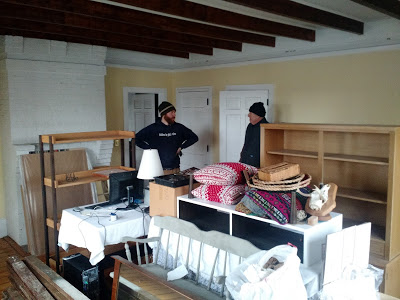
As a visual learner, I often have a difficult time imagining a space, any other way than the way it already is. So, at the start of most makeovers, I remove any existing furniture, and try to look at the space with a fresh set of eyes. Clear the space, to make room for imagination (That's the cheesiest thing I've ever written)

First, clear out the space so you can envision the possibilities!
(A)ssess
Next, I assess a space's ultimate nature. I ask questions like:
How will this space be used?
What emotions do I want the room to evoke?
Does the room have existing, architectural details that should be showcased?
These questions may seem simplistic, but I've noticed that often, people rushed to create a "design forward" space (perhaps based on a favorite Pinterest tag), without REALLY stopping to think if the design will be functional, when tested day-to-day.
Answering these simple questions, from the start, will allow the feel and function of the room to emerge first, before you get you're heart set on a color scheme or piece of furniture.
Annex Guest Room Assessment:
How will this space be used?
The Annex will be used 75% of the time as a guest room and 25% of the time as an extended living space. Nothing of the furniture in the room will be permanent, so the space can be functionally diverse.
What emotions do I want the room to evoke?
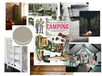
I want this space to feel natural and nostalgic, like summer camp. Overall, more masculine then feminine, but with a carefree, child-like whimsy.
Does the room have existing architectural details that should be showcased?
The room has four, original historic windows that I will use to draw the eye in and up, and play into the nostalgia I am hoping to achieve.
(P)rocess
I suggest giving yourself plenty of time to process a design, allowing your plan to shift and change. For me, the essence of designing a space is allowing it to develop and grow organically.
This is helpful in a couple ways: 1.) It enables me to stay on budget & 2.) It keeps the design fun, and discourages disappointment.
There's nothing worse than getting your heart set on a (rug/light fixture/tile selection/couch) only to realize it's way out of your budget or on back-order for 6 month.
(S)tory Board
In whatever manner suits you best, create a story board. My suggestion is to not be so literal. Limit the exact "accessories" on your board, and rather include images that reiterate the answers from Step 1's assessment.

Here's what I have in-store for the Annex Guest Room makeover! Does it feel nostalgic, masculine and whimsical?
Let me know what you think by commenting below and follow along with all the other


Check out the Week 6 One Room Challenge reveal of our vintage summer camp inspired decor guest room.