RENOVATION REVEAL: South Street Kitchen

Happy Friday Everyone! Though we're always excited for the weekend, we are even more excited to share the reveal of the South Street kitchen renovation project with you!
Be sure to scroll all the way to the bottom of this post for all our materials and sources, or click here for our shopping list on Amazon.
If you've been following along with this project on our Instagram feed, you may remember a large space with tons of potential, sadly being bogged down by dark wood trim and linoleum tile floor.


About a week ago, I shared the full Before story of this kitchen which you can look back on here.
ORIGINAL LAYOUT

A previous owner had expanded the kitchen with the addition of a breakfast nook and mudroom, but the wall added for structural support cut the space in half, segmenting the kitchen and forcing all the appliances into a compact area centered around the kitchen's main entrance.
For such a large room, the original layout was not maximizing the square footage.
PROPOSED NEW LAYOUT

The main objectives for this renovation were:
Optimize the square footage
Utilized the space more efficiently
Allowed natural light back into the work areas
Additional storage
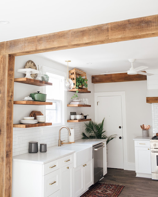
With the removal of the half wall and addition of the exposed wood beam, achieving all of our objectives became possible.


This kitchen is chock full of John's custom woodworking!
All of the wood details including the exposed beams, open shelves and range hood cover are locally sourced, rough sawn, white oak that John fabricated and installed.


Addressing the homeowner's request for "dog friendly" flooring, we installed wood grain, ceramic tiles for easy cleaning and upkeep.
Also, love the versatility of this floor basket for a larger house plant.

The new cabinet layout nearly doubled their storage, and allowed the addition of open shelves that could be used more aesthetically.

The fireclay farm sink is the perfect addition to this modern, yet rustic kitchen design. And the bronze kitchen faucet added a bright, refined style to the classic shaker style cabinets.

Recessed lighting was added throughout and additional light fixtures were installed above the sink, breakfast table and mudroom. The ceiling fan was replaced with this beautiful, modern design by Minka.

Finding this brick chimney behind the wall was like Christmas morning. The natural, red brick adds an earthy warmth and texture.


Crisp, white, 2x8 elongated subway tiles and grey grout add an industrial feel to the sink and range workspaces.

These beautiful, 2 inch thick rough sawn oak shelves are made possible with floating bracket technology by Shelfology.

A custom built-in adds a bit of whimsy and additional storage for cook books.

The vintage inspired drawer pulls and cabinet knobs are finished in brass which adds a bit of old world charm back into this otherwise new space.

This vintage butcher block accented the space perfectly! It was the homeowner's grandfathers and used to reside in their family's butcher shop. We added casters which created a mobile workspace for prep.

These vintage Cesca chairs, finished in ivory leather, took my breath away at the thrift store.
Paired with this round natural fiber rug, tulip table and aqua barn light, the breakfast nook is so inviting.


Big thanks to our fabulous clients, Mark and Marie, for giving us this amazing opportunity to work within their beautiful home! And to Veronica Lola Photography for the stunning 'after' images.
If you are into this renovation style and materials, then here are most of the products all rounded up for you. Where the exact product is not available, we've provided a comparable suggestion.
SHOP THE LOOK:

1. Brass and Glass Globe Pendant Light
2. Ceiling Fan
6. Tulip Table
7. Cesca Chair (similar)
8. Ibiza Quartz (similar)
9. Vintage Bronze Cabinet Pull
10. Vintage Bronze Cabinet Knob
Share your feedback below!


