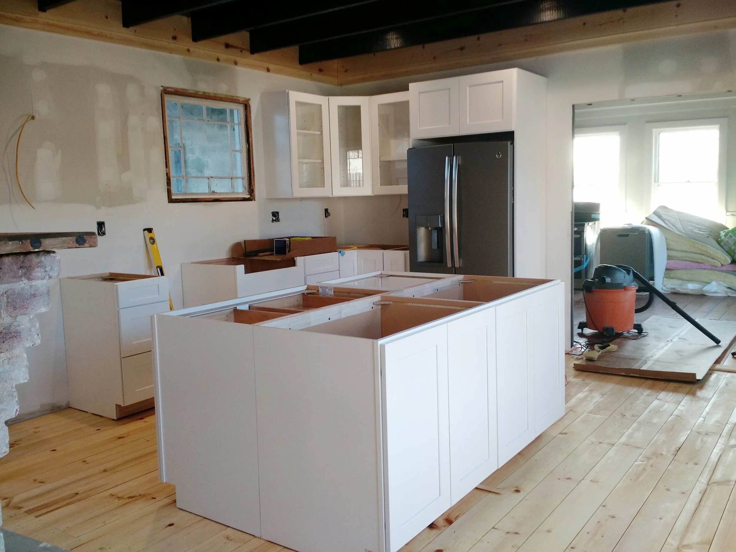
RENOVATION: South Street Kitchen (Before)
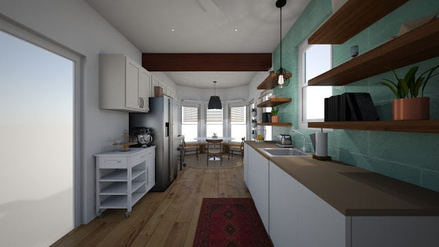
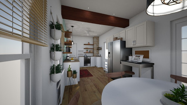
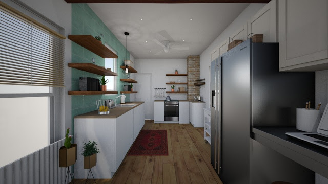
South Street Design Rendering
As some of you may have seen on the Content + Company Instagram feed, we've been working with our clients on the #southstreetkitchenreno for the past 3 months, but believe it or not, this project has been a year in the making.
Let's back up to early 2017, when Mark and Marie contacted John to build them a custom dining room table.
During our very first meeting, with the then engaged-to-be-married couple, Mark and Marie showed us around their beautiful, c. 1910 home. Full of charm and character, the previous owners had only made minor upgrades to the house. That night, seated at a humble folding table, Mark and Marie shared with us their plans for upgrading the house, with hopes of entertaining friends and family. Mark was ready to cook and we were ready to help!
Even in full wedding planning mode, Mark and Marie were eager to discuss their priority, post-nuptial project - the Kitchen.
And now, exactly 1-year from that very first meeting, we are wrapping up a full kitchen renovation for this awesome, now, husband and wife.
BEFORE
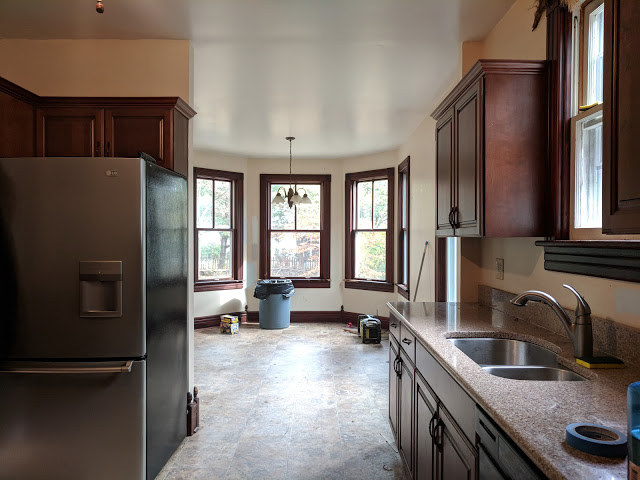
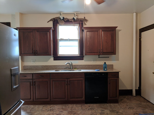
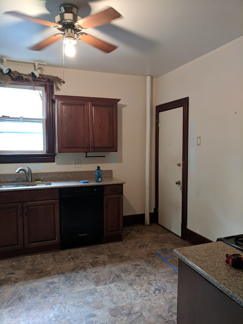
The bones of this space were not too bad. Six, double-hung windows allow a ton of natural light into the room, and an addition put on by the previous owners (including the breakfast nook and mudroom), made the overall kitchen about 350 square feet. Plenty of room for improvement!
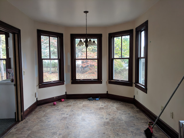
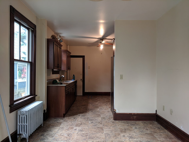
Half-wall
Curiously, during the construction of the breakfast nook addition, the previous contractor choose to add this dividing wall, likely as structural support, instead of adding a ceiling beam.

Though the addition may have been structurally sounds, the new wall presented mostly design "cons". It cut the space, visually, in-half, forced the refrigerator to open into the kitchen/dining room entry door and blocked all of that wonderful natural light. There was also a tremendous amount of unused space between the breakfast nook and the fridge wall.
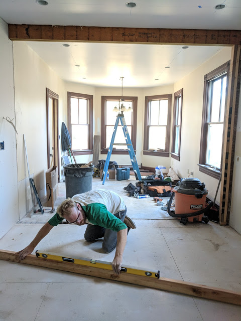
Early on, we knew the wall had to go. Luckily, the removal of the wall created a great opportunity for us to add an exposed beam, not only for ascetics, but also for function.

DESIGN
During our first design meeting and throughout the initial design process, Marie shared a Pinterest board chock full of images that would continue to inspire this project.
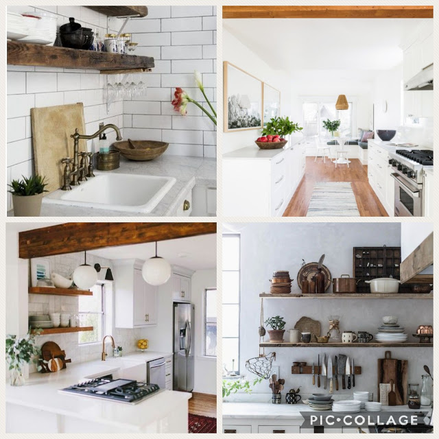
Stylistically the couple both wanted a functional, fresh, bright and airy space but individually Mark leans more industrial while Marie craves warmth through natural wood. Marie also liked the idea of playing with a "pop-of-color" which I can't wait to share with you in the reveal.
A post shared by john and courtney achilli (@contentandcompany) on Nov 9, 2017 at 2:58pm PST
Here are the design renderings I originally presented to Mark and Marie:

PROGRESS
The South Street project was, give or take, a full renovation. Here are a few of the construction milestones that helped shape this new, amazing space:
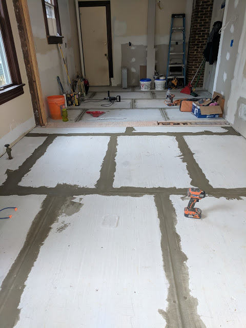
Removal of 4 layers of linoleum

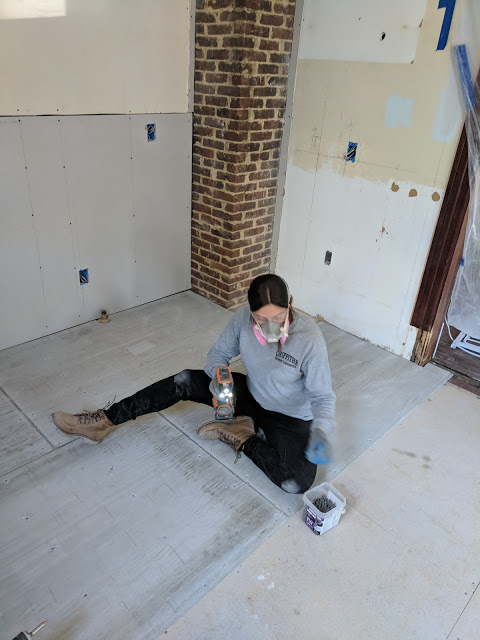
Exposing the brick chimney for architectural interest
A post shared by john and courtney achilli (@contentandcompany) on Nov 6, 2017 at 10:07am PST
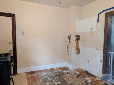
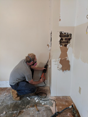
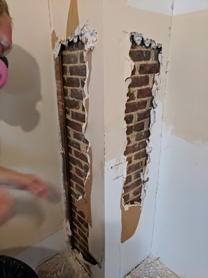
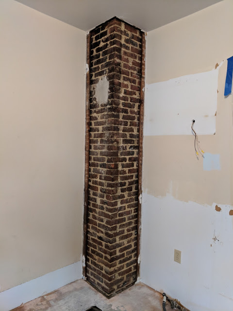
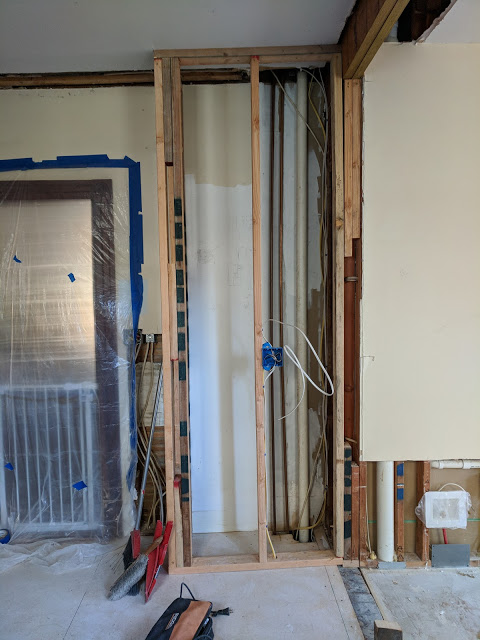
Removing the half wall
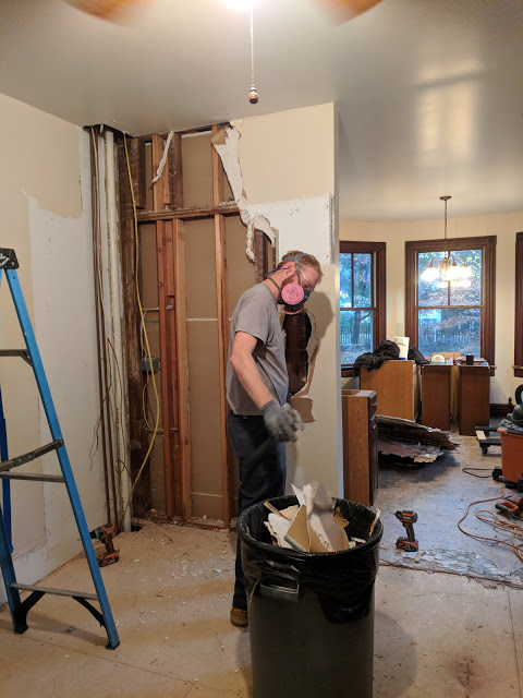

Adding the expansion beam
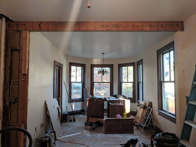
Re-configuring the walls to accommodate additional cabinets and a center facing refrigerator
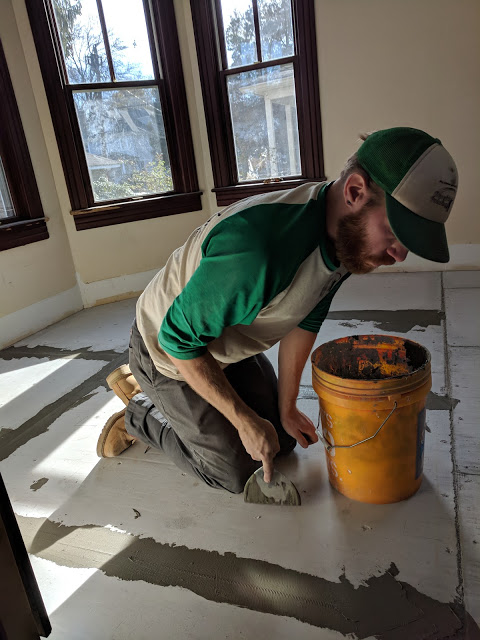
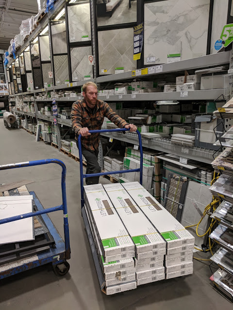
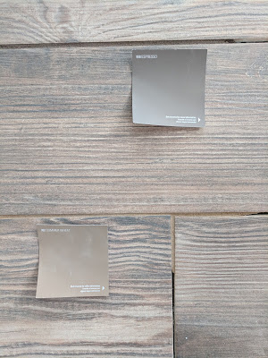
Ceramic, wood grain tile flooring throughout

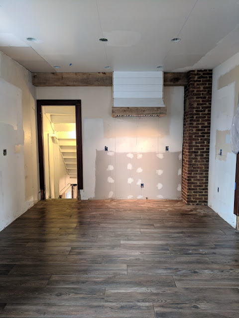
Ceiling beams wrapped in rough-sawn oak
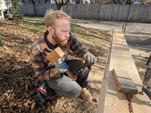

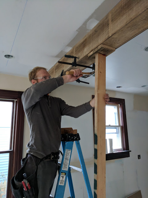
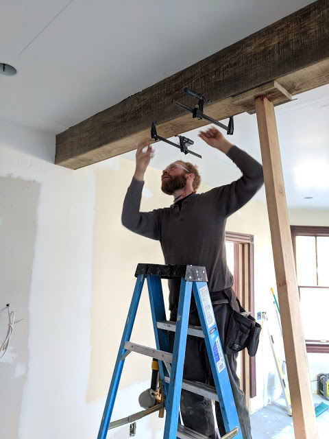
Custom range hood
A post shared by john and courtney achilli (@contentandcompany) on Dec 13, 2017 at 9:09am PST
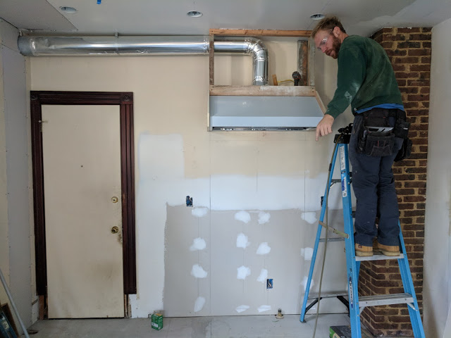
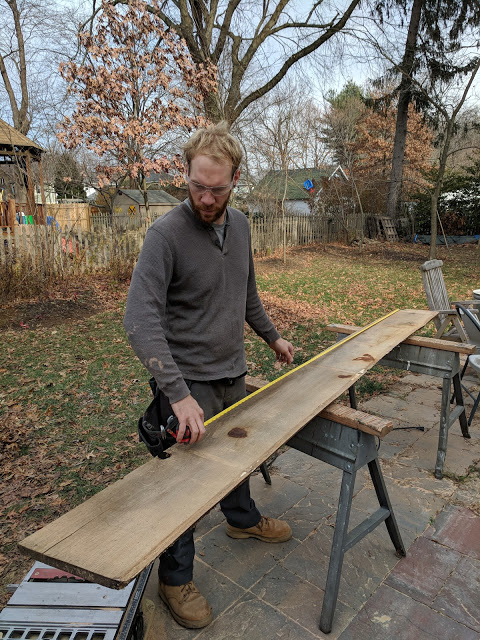
All new, white cabinets
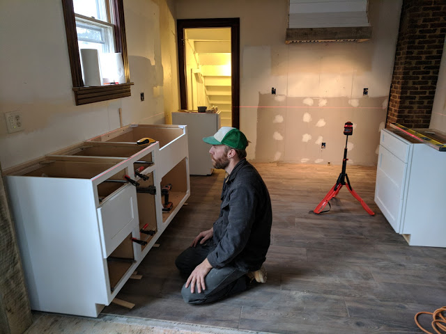

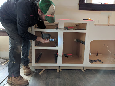

Apron-front farm sink
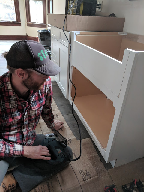
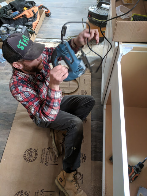
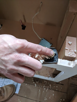

Recessed lighting throughout
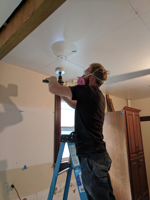

That's it for now! You didn't think I was going to spill all the renovation beans, did you? Stay tuned for our big reveal of the South Street Kitchen, coming VERY soon!
OH, and if there are any progress projects you'd like to hear more about in a separate post, please comment below!


